
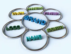
Using your vehicle(s) to help brand your company should be part of an overall marketing and branding effort, so that what ends up on your fleet is an extension of all the other marketing your company does.
Accomplishing this takes more than just manual labor and the ability to print. It requires an understanding of proper branding and the application of the rules of effective advertising with an outdoor medium.
The following tips will help you realize the maximum impact and return on investment for your outdoor vehicle advertising programs.
For businesses trying to make an impact in their community the message is always about the brand, so unless you have national brand recognition, your brand should always be the primary message for a vehicle wrap.
One reason so many wraps fail from a marketing perspective is because the business has a poor brand identity and logo. Starting with a poor brand means you've failed before you've begun: by wasting money on a wrap and missing a huge marketing opportunity.
Some sign companies won't mention this because they don't want to lose business. They'll print whatever the customer wants. But it's too much money to play with.
A good graphic design company doesn't want to be responsible for wasting your money by trying to work with a brand that has no business being implemented on a wrap. They will educate you on the challenges of your brand. And they will stress this simple point: the brand is the message, period.
I've had this discussion often with other sign makers and some disagree with me on this point. However, I believe there are few effective wraps that use photos, and I'd argue that any wrap that uses a photo could have been more effective without one. The photo is not a brand identity; it doesn't connect the customer with the business name. Maybe it connects them with what the company does, but so should a good brand.
Take the usual examples, like the HVAC contractor with a picture of an air conditioner. Great. I know you do air conditioning, but who are you? I don't know, because I only have 2.5 seconds to view your message. Or consider the contractor and the picture of a house. Are you a siding company, a roofing company, a window installer, a power washer, a landscaper, an electrician?
I have no idea because the photo is the dominant element. After my 2.5 seconds are up, your message is lost among all the other things trying to grab my attention.
Perhaps a photo can be used on box trucks or trailers, but I'd still argue a more powerful brand integration would be more effective. National chains have an easier time using photography because, once again, their brand is already known.
There are only three or four things a good wrap needs: strong brand implementation, perhaps tagline messaging, a web address, and maybe a phone number. Bullet lists, which look more like shopping lists, have no place on a vehicle. This isn't the yellow pages. Would you rather list ten things and have none remembered, or convey one to two memorable takeaways?
If this truck were a billboard, how much copy would be on it? Billboards have the exact same challenges as vehicle advertising. If you prioritize your copy, it will be more effective. In general, the hierarchy should always be: brand, tagline, web address and/or phone number.
This doesn't mean diamond plate, carbon fiber and tribal flames will make your truck wrap stand out. Quite the contrary. By eliminating all those fills, noisy backgrounds, photos, bevels and glows, you'll be on your way to having a vehicle that actually does stand out.
The wrap market is littered with visual noise. When people see something with impact — something they can actually read and remember — it can't help but stand out among the visual clutter. That's what is so ironic to me. People think our vehicle wrap designs are innovative simply because they are unlike what everyone else seems to be doing. So — they stand out.
If the viewer needs to work too hard to figure out the primary brand messaging, the opportunity for recognition is lost. The vehicle graphics medium isn't the same as print design where the viewer can stop, absorb the advertising and try and understand the message. Identify the one primary takeaway you're hoping to leave with the viewer.
Your wrap should effectively communicate that takeaway. Without getting lost in imagery. You have very limited time to capture the viewer's attention and have your brand be understood and remembered. Your message needs to be 100 percent focused on who you are and what your brand is.
 Dan Antonelli is the founder, president and creative director of Graphic D-Signs, a New Jersey-based advertising and marketing company catering exclusively to small businesses and focused on branding, web design, marketing and advertising services. He is a recognized expert on small business branding and author of two books on logo design, as well as dozens of articles on graphic design, branding, vehicle graphics and related topics.For additional information, visit graphicd-signs.com.
Using your vehicles to help brand your company should be part of an overall marketing and branding effort, so that what ends up on your fleet is an extension of …
Don’t let nostalgia, “nephew art” and lack of standards hold your business back.
Using your vehicles to help brand your company should be part of an overall marketing and branding effort, so that what ends up on your fleet is an extension of all the other marketing your company does.
Your original brand may have gotten you off the ground, but now it may be hindering your growth.
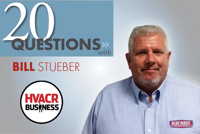
Bill Stueber, owner of Blue Ridge Heating and Cooling in Pine Beach, N.J. and a 2015 Tops-in-Trucks Fleet Design Contest winner, discusses the challenges of finding good people, updating the company brand and transitioning the business to his daughter.