
Whether your company is large or small, commercial or residential, one of the most important things you need to do is advertise. No matter the size of the business, all HVACR contractors face the same dilemma: How best to use those advertising and marketing dollars.
The not-so-secret secret to success many contractors have learned is to invest in an eye-catching, memorable design for their biggest asset — their fleet of vehicles. On the roads driving from job to job, parked at a call or at a technician’s home after hours, your trucks are seen by countless customers and potential customers every day.
“Remember that when potential customers see your vehicle, more than likely they’re in their own vehicle, so making your brand easily identifiable and your contact information easily readable is of the utmost importance,” says Joseph Kalinowski, creative director for the Content Marketing Institute.
There’s no reason why you shouldn’t use this vast amount of real estate to advertise your company and get your message out there.
And, throughout the years, more and more contractors are taking advantage of it and upping their game when it comes to bold, impactful designs that set them apart form the competition.
Now in its 13th year, our annual Tops in Trucks Fleet Design Contest pays tribute to those contractors who go above and beyond to set forth a positive, lasting impression of their companies and this industry.
“As you can see with this year’s finalists, there is a consistent theme: Bold colors, recognizable iconography and legibility were key to securing a top spot,” Kalinowski says. “Having a large, well-placed and recognizable logo is always key for any brand who advertises on outdoor media such as vehicles or outdoor signage such as billboards.”
The days of a fleet of white vans with the company name, phone number and every possible service plastered on the side are going by the wayside as evidenced by the hundreds of entries we’ve seen over the years.
Marketing savvy contractors have dialed in to the use of bold colors, impactful imagery and only the most essential information on their trucks to put themselves top of mind when it comes to HVACR services in their market.
“What takes this year’s winners to the next level is the not just the icon placement, but their placement and ease of legibility of their contact information,” Kalinowski says.
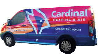 Cardinal Heating & Air
Kirkland, Wash. | 41 vehicles
Rory Richardson & Mike Hastings, owners
Change can sometimes be a difficult thing to embrace, especially when you’ve been doing the same thing since Day 1. Rory Richardson and Mike Hastings started Cardinal Heating & Air in 1991, and they’d used the same basic logo for many years while building their business to where it is today.
“Sometimes, the mentality is, ‘if it ain’t broke, don’t fix it,’” says Kevin Breiwick, general manager for Cardinal Heating & Air. “But the old look was dated and we kind of just blended in with everyone else.”
Even though the company had a great reputation, and received a lot of referrals from other contractors because of their expertise in certain areas, the feeling was that the average homeowner didn’t know them because their trucks didn’t stand out.
Breiwick took charge of the redesign initiative and looked to the connections he’d made with other contractors around the country. That’s how he found KickCharge Creative.
“I honestly really didn’t shop around,” Breiwick says. “It was just like, ‘Yeah, this is the right fit, and these guys know their stuff,’ so that’s how we went with them.”
After filling out a questionnaire, Breiwick gave KickCharge the direction they needed to come up with the company’s winning truck design.
“I presented a few of the designs to the management team and then momentum took over,” Breiwick says. “I said, ‘If we’re going to do this, let’s do it.’”
What resulted from the consultation with KickCharge was a professional, modern design that isn’t, what Breiwick refers to as, “too gimmicky.”
“It has a professional feel that appeals to our builders, as well as the general public,” Breiwick says. “The bird logo is something we’d never had before, but it really works from a branding standpoint.”
The goal was a design that could be used beyond the trucks … a logo that employees would be proud to wear on a hat or a shirt. Something Breiwick refers to as a cool factor.
“Our name didn’t change, who we are and our core values didn’t change, or how we did business,” Breiwick says. “It’s just what we’re presenting out to the public changed.”
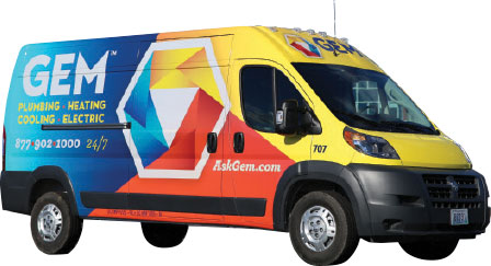 GEM Plumbing & Heating Services
Lincoln, R.I. | 175 vehicles
Larry Gemma, owner
Founded in 1949 by Owner Larry Gemma’s father, GEM Plumbing & Heating Services is a family business that was ready for a fresh, new look to celebrate its 70th anniversary.
“We wanted something that was extremely bold, and that was going to show up … that you could see from anywhere,” Gemma says. “And that’s exactly the presence that it’s created in the Boston and Rhode Island markets.”
To come up with their bold, winning design, Gemma gave the task to Jenny Preservati, business development manager, and Jenn D’Ambra, vice president of operations. The pair took the mission very seriously and began with a lot of research.
“We actually started Googling images of different trucks and saving them in a Word document,” D’Ambra says. “Then we’d show them to different people around the office, as well as our technicians, and ask what they were drawn to.”
What they found, time after time, was that two trucks in particular kept catching the eye of everyone they surveyed. After digging a little further, they discovered that both those trucks were created by the same design firm: KickCharge Creative.
After contacting KickCharge, D’Ambra continued to do her due diligence on the truck design.
“KickCharge sent over two different color pallets,” she says. “I preferred one, but we decided to see which one would catch the eye of the public better.”
D’Ambra and Preservati took both color pallets to two different locations in their market and started surveying the public. Contrary to what they thought, the blue, yellow and orange combination won out nearly every time.
“It really drove home the idea that when you select a color combination for your company, you shouldn’t necessarily go with the one you like best,” D’Ambra says. “The idea is to choose something that might be a little uncomfortable, something people aren’t used to seeing, because that will grab their attention.”
With the color palette chosen, GEM went full steam ahead with KickCharge on the actual design of the truck and, eventually, a complete company rebranding.
“We did the trucks first, most importantly because that’s our best return on investment,” D’Ambra says. “The money we spent there is seen instantly, daily, with a fleet of about 150 wrapped vehicles.”
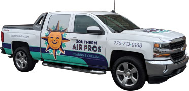 Southern Air Pros
Woodstock, Ga. | 3 vehicles
Bill Lewis, founder & CEO
As a Navy veteran who started Southern Air Pros in 2016 after working for several other residential and commercial HVACR companies, Bill Lewis has a small company focused on owning the residential market in Woodstock, Ga.
“Honestly, our main focus is we just generally want to own our back yard,” Lewis says. “The idea is to have, essentially, two strong teams, each having a technician and a install crew so that they feed each other.”
The original design for Lewis’ fleet of three vehicles was a burgundy van with a compass on it and the words, “Southern Air Pros” … with the southern point on the compass tying it all together.
“But it wasn’t getting anyone’s attention,” Lewis says. “It’s a rolling billboard and no one was noticing it.”
As an avid reader, Lewis says another contractor suggested he read Dan Antonelli’s book, “Building a Big Small Business Brand,” and that’s when he decided to contact KickCharge Creative.
“I would visit their website and the chat pop-up kept coming up, and I’m like ‘no, no no,’” Lewis says. “Then, all of a sudden Dan himself popped up in the chat window so I asked him a couple of questions, which lead to a full on conversation.”
KickCharge listened to what Lewis had to say, figured out where they were going as far as a company and what kind of image they wanted to project. After some back and forth, they presented Lewis with a design that won him over.
“Dan has a good way of getting you to understand what you may not want to hear,” Lewis says. “With my previous logo, he asked what the story was with the compass. I told him it was because I was in the Navy and it reminds me of direction and ties into our name.
“But then he said, ‘What’s that got to do with air conditioning,’” Lewis recalls. “I admit, I didn’t know.”
Southern Air Pros new trucks feature a unique color scheme with a smiling sun — which, if you look closely, incorporates the compass points in its rays.
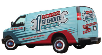 1st Choice Air Comfort
Howell, N.J. | 3 vehicles
Christopher Riley, owner
Chris Riley, owner of 1st Choice Air Comfort, understands the need for an HVACR company to set itself apart from the competition.
“In New Jersey, we’ve only recently had licensing so there’s a need as a company to put forth an image of one that dots its I’s and crosses its T’s, so to speak,” Riley says. “We made a substantial investment in opening the company to ensure we could perform quality work and provide service that was above and beyond the other companies in the area.”
To help promote this image, Riley knew they needed to come up with a brand that made the customer feel like they were in good hands. So like any diligent business owner, he did his research and found a company that could help him portray that image: KickCharge Creative.
“I had never heard of them before, and when we started talking with them, it just seemed that their idea of business, and our idea of business really aligned,” Riley says. “And we just fell in love with the work that they did.”
Riley and his wife spent nearly a year developing their business model and brand, putting all the pieces in place before they opened the door. That included using his father-in-law’s classic car collection as inspiration for their fleet design.
“We envisioned a 50s diner feel and when we mentioned that diner hot rod, waitresses on roller skates kind of vibe, that’s when the colors clicked and the formula came together for our brand,” Riley says. “We’re not your typical red, white and blue contractor van, so we really stand out.”
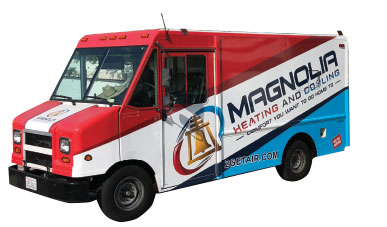 Magnolia Heating & Cooling
Riverside, Calif. | 17 vehicles
Eric & Brenda Smith, owners
As third generation owners of Magnolia Heating & Cooling, Eric and Brenda Smith knew it was time to update their image as a company and make all of their advertising consistent across the board.
“Something fresh is always good,” Brenda Smith says. “We live in a world where we see the same things over and over again, and to make yourself stand out, sometimes you have to do something that’s pretty unique to get noticed.”
The only way you can do that is by taking a chance. And the chance Magnolia Heating & Cooling took was to hold an online contest with designers to come up with a new brand.
“If you look up Riverside, you’ll see that the Raincross, which is a bell inside of our logo, is the symbol of Riverside,” Smith says. “When you drive down the streets of downtown, the bell is on all of the light posts. It’s just really a staple feature of our area, so we wanted that as part of our logo all along.”
The results of that contest presented the Smiths with the colors and the logo they settled on for their rebrand. Then, with those colors and logo, they got to work designing their trucks.
“We have a guy that we worked with that helped us come up with that design,” Smith says. “That was a trying time, between my husband and I, to come up with one that we both agreed on. We both really love the way it looks now, so it worked out well.”
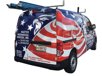 Master Mechanical Services
Miami | 17 vehicles
Tina Pinna & JoAnn Pinna, owners
For years, family company Master Mechanical Services used the same truck design — white or red vehicle with a small eagle logo and lettering designating their name and all their services. It did well enough, until co-owner Tina Pinna purchased a new vehicle for the fleet and decided she wanted something new.
“When I contacted our lettering company, who had done our vinyl lettering for the past seven trucks, I told them I wanted something new,” Pinna says. “The first three designs they sent back had all the same information, but in a different layout.”
After some back-and-forth via email, Pinna finally called the designer and told her she didn’t just want a different layout, she wanted something completely different. She gave the designer free-reign.
“When she finally presented me with three new, completely unique designs, it was time to sell it to my family,” Pinna says. “We’re a family business and all decisions are made by the family … so it was important to get my father on board, since he started the company and had come up with the original design.”
When the new designs came back, Pinna says they were actually on a family vacation. Relaxed and away from the business, she showed the designs to everyone and told them to pick one without telling the next person. Majority wins.
“And we were pretty much all on board,” Pinna says. “There was no argument and I think it may have helped that we were on vacation so we were away from the stress of the business.”
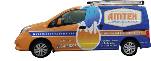 AMTEK HVAC
Bayville, N.J. | 4 vehicles
Dana Melisi, owner
Anthony and Dana Melisi started AMTEK HVAC together in 2007 when they were just dating and have worked together to grow it steadily over the past 12 years. But, in 2017, tragedy struck Anthony when he became paralyzed with Guillain-Barré syndrome, a rare neurological disorder in which the body’s immune system mistakenly attacks part of its peripheral nervous system.
“I was paralyzed in the hospital and I went through ten days of ICU and 30 days of rehab and then another eight months of outpatient rehab,” Melisi says. “That’s how Dana ended up taking over the company a few years ago. So she does all the operations.”
Prior to his hospitalization, the Melisis had been following Service Nation Alliance and learning a lot from the membership. Once he was out of rehab and back working, they’d decided it was time to move forward with Service Nation Alliance and implement a lot of what they’d learned.
“We learned that rebranding wasn’t simply a new logo or a new truck, but a whole campaign letting everyone know that you’re a new company,” Melisi says. “Personally, I had to re-learn how to walk and feed myself … I was reborn; so our company too was reborn as a proud, woman-owned business.”
AMTEK HVAC wanted to portray an old-school look that customers would recognize as providing old-time service, while also using the latest technology. The blue and orange colors remained, but were intensified to be as bold and memorable as possible.
“It’s all about keeping the design simple … tell your story and get it done,” Melisi says. “The most important thing to me that we’ve put on our vans when we rebranded is on the back door: it says ‘a woman owned business’ because when I got sick Dana really did own this business, she took it over with zero input from me, in hours notice.”
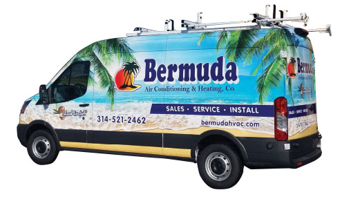 Bermuda Air Conditioning
St. Louis | 7 vehicles
Rich & Michelle Henderson, owners
Like many HVACR companies, Bermuda Air Conditioning is a second-generation owned business. Rich Henderson and his brother bought the company started by their father about 25 years ago and, when Rich’s brother decided to retire five years ago, he bought him out.
“Once I bought him out, we really turned the company around and have been growing ever since,” Henderson says. “Then, when it came time to replace a couple of our old trucks, I thought we should do something different.”
The name Bermuda Air Conditioning originated from the street they’re located on in St. Louis — Bermuda Road. But Henderson always liked the idea of “Island Comfort” as a way to put the customer at ease.
“I think most people would think that being on an island is nice and comfy,” Henderson says. “I worked with a local graphics company, VMG, who do a lot of signs and lettering and wraps.”
After reviewing a few different designs, Henderson decided on the calming beach and palm trees backdrop for his van. And, at the suggestion of VMG, dropped a lot of the typical information and multiple phone numbers he was used to cluttering up his trucks.
“People have to be able to look at it, and they only have five, 10 seconds … then it’s gone, you know?” Henderson says. “You’re going the other way, or you’re going down traffic, or that kind of thing. You want to just put as little information as you can, let people get the idea and then it’s a more lasting impression.”
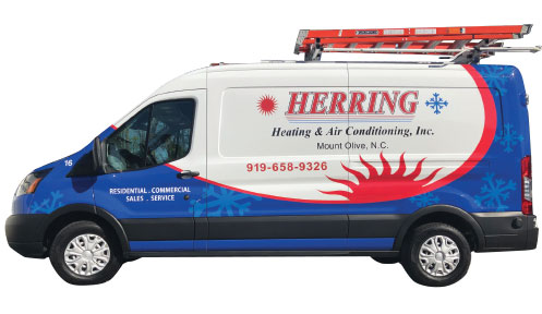 Herring Heating and Air Conditioning
Mt. Olive, N.C. | 14 vehicles
Kevin Herring, owner
When Herring Heating and AC, Inc. was founded in 1970, Billy Herring wanted a patriotic color scheme of red, white and blue to represent the company. Billy’s son Kevin now owns the company and decided it was time to honor his memory by updating, but not altering his original vision.
“It was actually my wife’s idea,” Herring says. “She’d been on me for quite some time … whenever she’d see another wrapped vehicle on the highway, she’d say, ‘That’s great advertising!’”
So, two years ago, Herring finally pulled the trigger on designing his company’s rolling billboards.
“Once it was decided that we needed to update the look of our fleet vehicles, several of the employees came up with a design and then the concept was polished and finalized by our team salesman, Skip Tucker,” Herring says.
“We then sent the concept design off to the graphic designers who came up with a layout that we approved as a team.”
The logo didn’t really change, but the way it’s presented on the new wrap really makes an impact and the trucks have an entirely new look.
“It’s almost a complete makeover from what we’ve always had, but in a positive way,” Herring says. “My dad created the logo in the mid-90s and even when he retired in 2006, he’d see the trucks on the road every day. He passed away a year and a half ago, but I know he’d love that this new design is getting some recognition.”
April 2026 HVACR News
April 2026 HVACR Products
April 2026 HVACR Products
April 2026 HVACR Products
April 2026 HVACR Products