
Fleet vehicles remain the main source of advertising for many service companies, and standing out is becoming more and more competitive. Gone are the days of simply relying on word of mouth — today’s HVACR contractor has to put forth an image that is both professional and memorable.
Since we first started our annual Tops in Trucks Fleet Design Contest back in 2007, the submissions have gotten more sophisticated — making our panel of judges’ job more difficult.
One thing we always look for in a winning design is the immediate impact it makes upon first glance. Is it bold? Is it memorable? Does it tell you what this company is all about?
These are all qualities you want in your rolling billboards, and one way to emphasize those qualities is through the use of color.
“The winners in this year’s Tops in Trucks Fleet Design Contest have one shared and resounding quality: Boldness,” says Joe Kalinowski, creative director for the Content Marketing Institute. “The use of deep red makes their vehicles stand out against both urban and suburban scenery.”
It’s not uncommon for HVACR companies to use variations of red and blue, hot and cold. But to really stand out, you have to rise above and look at color in a new way.
Emphasizing one color over another is a great way to be seen and using a different shade of red can be just the thing that separates you from the competition.
This year’s winners — Air Max A/C & Heating; Colonial Plumbing, Heating and Air; and Sierra Pacific Home & Comfort — have taken boldness in fleet graphics to a new level and are well on the road to success.
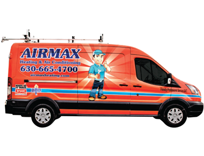
Roselle, Ill. | 3 vehicles
Mike Waszak, owner
Located just outside Chicago in the village of Roselle, Ill., Air Max A/C & Heating faces a lot of competition, so it was more important than ever to stand out.
To make sure his company didn’t go unnoticed in the crowded marketplace, Mike Waszak, owner of Air Max A/C & Heating, decided to maximize the use of advertising space on his trucks. He wanted something simple, yet eye-catching.
“I worked with a graphics company, bouncing ideas back and forth until we came up with the design,” Waszak says. “I’m sure I could change a lot more, but you have to be done with it some time.”
The finished design is bold and bright and definitely stands out. Kalinowski says the use of colors alongside the custom illustration of the technician mascot really makes a statement.
“The beams of light emanating off of their mascot also draws the eye in making the van very recognizable,” he says.
The design was first implemented last March and so far, Waszak says, they’ve gotten a lot of great feedback from customers.
“They like it better than a plain white van,” Waszak says. “It’s great, especially when a potential customer comes up and asks for a business card and tell us they like our logo.”
Although Waszak has only wrapped one van so far, he plans to soon wrap the other two vehicles in his fleet. With an initial investment of $10k, Waszak is confident he’ll soon see a tremendous return thanks to the increase in business from Air Max’s high visibility.
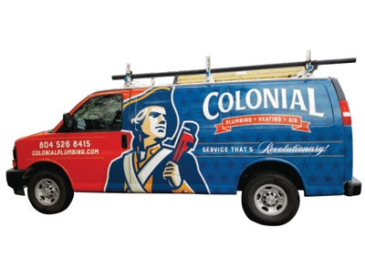
Colonial Heights, Va. | 25 vehicles
James Kester, owner
It’s not difficult to figure out where Colonial Plumbing, Heating and Air drew inspiration for the branding on it’s fleet of vehicles. The company is located in central Virginia, which already has a colonial theme to it, in a city called Colonial Heights.
“You add all of that together and it makes sense for us to use the image of a Colonial Minuteman,” says James Kester, owner of Colonial Plumbing, Heating and Air. “Plus, it stands for someone who is quick to respond — and that’s us.”
So it wasn’t too big of a leap to take when Kester began working with a marketing company to design their new look. The result is a design that is as unique as it is memorable.
Kalinowski particularly likes Colonial’s use of bold color, custom illustration and pattern work that makes the fleet immediately recognizable.
“Having the Minuteman illustrated in a confident stance, holding a pipe wrench instead of a musket is a win,” he says. “But what’s even more eye-catching is how the soldier sets off the juxtaposition of the solid red and the blue star pattern.”
The red and the blue aren’t the typical shades you see on most HVACR vehicles, and it was a bit of an adjustment for Kester when he first saw the design.
“That stopped me at first, because we expected to use the typical red and blue,” Kester says. “This has a more orange-red feel and I had no idea that that was the right choice. But once it was on the vans it made a world of difference.”
As a smaller company, Kester believed it was time to invest in his fleet — and overall marketing — to compete with the larger companies and national franchises moving into the area.
“We’re already a great company,” Kester says, “but now we put forth an image of professionalism that makes us known to the community.”
Not only has the investment paid off in additional customers, but also Kester says he regularly gets calls from experienced technicians who want to come work for him now.
“That is a benefit I didn’t expect,” he says. “So we’re running with it and extending our branding campaign to the local high school and vocational programs.”
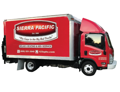 Sierra Pacific Home & Comfort
Rancho Cordova, Calif. | 60 vehicles
Jason Hanson, president
When Sierra Pacific Home & Comfort began wrapping it’s fleet about four years ago, it was pretty clear what color they were going to use for the new design.
Back in the 1990s, the company had a number of red trucks and it became common for customers to tell them, “We recognize you; you’re the guys in the big red trucks.”
“We used that in our radio advertising for a while, but then it faded away for a while,” says Jason Hanson, president of Sierra Pacific Home & Comfort. “When we began to refresh our marketing, we discovered that the phrase, ‘The Guys in the Big Red Trucks’ tested very well.”
Indeed, the big red trucks are immediately recognizable. Kalinowski applauds their ability to be incredibly bold while staying simple.
“While Sierra Pacific mainly works in two colors — red and white — the simple design of their seal seems to bounce off the side of their vehicles,” he says.
The use of the color red and the slogan became the company’s mantra.
“The concept is simple; just make everything red and say it repeatedly every time you see us,” Hanson says. “So it became a part of the logo and is used on everything.”
From print ads to direct mail to the vehicle wraps, Sierra Pacific has become known around town as ‘The Guys in the Big Red Trucks’ — and it’s paid off.
“Customers know us and remember us,” Hanson says. “And we’re highly recognized across town. It’s been great.”
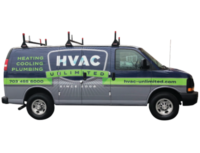 HVAC Unlimited
Lorton, Va. | 13 vehicles
John Cunningham, president
Sometimes, inspiration comes from an unlikely source. Such was the case for John Cunningham, president of HVAC Unlimited, when he decided to refresh his fleet and his marketing.
“I went back and forth with the marketing company on six or seven different designs, but nothing was really popping for us,” he says. “Then, I was in Seattle for business when I had an idea.”
Sitting at the airport, Cunningham noticed all the Seattle Seahawks gear, particularly the way the bright green popped against the dark blue and gray. He took that back to the designer and the result was HVAC Unlimited’s new look.
“I’ll admit, at first I wasn’t sure about the green, but everyone else really liked it,” Cunningham says. “I get comments on the look every day … I feel like we went from having a name to having a brand.”
The other thing Cunningham really wanted from his branding was a timeless look. He felt the best way to do that was through the badge logo.
“We needed to find good balance there,” he says. “We didn’t want to look like we’re too heavy on the residential side, and we didn’t want to look like we’re too heavy on the commercial side. I think that the badge style really does that for us.”
As far as a return on his investment, Cunningham has already seen an uptick thanks to this bold look with the pop of bright green.
“We have a lot more walk-ins now than we’ve ever had,” he says. “Our install department is booked out five weeks right now. I don’t think we’ve ever had that before.”
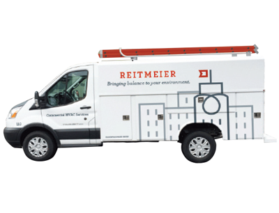 Reitmeier
Court Tualatin, Ore. | 26 vehicles
Jeff Nusz, owner
For a commercial company, vehicle branding is a different ballgame than it is for residential service companies.
“We used to put everything on our trucks,” says Jeff Nusz, owner of Reitmeier. “For 34 years, we had blue trucks and with white bubble lettering and straight lines underneath … it was very masculine; very mechanical.”
So, when Nusz decided it was time for a rebrand, he did some research. What they discovered, ultimately led to the look and feel of the company’s finished design.
“We realized that 85 percent of our clients were commercial property managers and of that, 75 percent were female,” he says. “So, we wanted a mark that would appeal to that female property manger instead of big, bad, boys, in-your-face mechanical company look.”
The other major thing Nusz did was drop ‘mechanical’ from Reitmeier Mechanical, simply going by the name Reitmeier, which now lends itself to other divisions he can open up.
On top of the new design of the wrapped vehicles, Reitmeier invested nearly $750,000 upgrading the fleet itself.
“The old fleet was failing due to age … gas consumption was awful,” Nusz says. “We went with the Ford Cutaway with an all aluminum body, which gives us two things: more payload and a sustainable material.”
So far, fuel usage is down 30 percent and Nusz says they’re experiencing a savings of $20 to $60k annually — not including the soft ROI of increased visibility in their market.
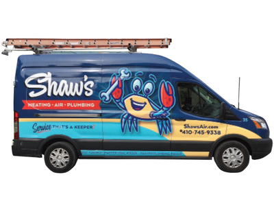 Shaw’s Heating, Air Conditioning & Plumbing
St. Michaels, Md. | 11 vehicles
David Shaw, owner
When David Shaw, owner of Shaw’s Heating, Air Conditioning & Plumbing, decided it was time to rebrand his company, he wanted to make sure he embraced the local community in his small town around the Chesapeake Bay.
“This whole area is built around the blue crab industry,” he says. “So, I brought that idea to the marketing firm and they just ran with it.”
The result is not only a friendly, memorable character logo, but also an overall design that fits in well with the area. From the light blue backdrop representing the sky to the deep blue representing the Bay and the sandy beige stripe symbolizing the shoreline, Shaw’s fleet looks like home.
“Almost everyone in our market lives on or near the Bay with a dock,” Shaw says. “We wanted to put forth a professional image while still showing our local roots and we couldn’t be happier with the finished design.”
As part of the rebranding launch, the company held a ‘Name the Crab Mascot’ contest and received many submissions from customers. The winner, which took into account Shaw’s longtime company slogan, “That’s a Keeper,” was Keeper.
“Everything about this process has created a morale boost within the company,” Shaw says. “It’s let our employees know we’re taking steps for the future, which is something I never considered when we started this.”
Since Shaw’s first implemented the new design, Shaw has already noticed a few other service companies who have debuted wrapped vehicles, but takes pride in being the first and only HVACR company in the area.
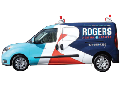 Rogers Heating & Cooling
Halifax County, Va. | 6 vehicles
Joseph Rogers, owner
Rogers Heating & Cooling was founded in 1996 and, for nearly 20 years, was run without any kind of branding, relying purely on word of mouth. Then, Joseph Rogers joined his father’s company in 2016 with a vision for growth and to become the leading HVACR contractor in the community.
“We knew to do that we had to make an impact visually and we couldn’t think of a better way to do it than our van,” he says. “I’ve seen other branded vans in other areas that were eye-catching and I wanted our brand to be just as eye-catching for our customers.”
Once Rogers set a plan for growth, they began doing research and found a marketing company to help them design their new look.
“We didn’t have any brand recognition whatsoever and they were able to talk us through the process,” Rogers says. “We let them know we wanted to do this as a step-by-step process and not a huge roll out.”
The marketing firm was in line with that plan and Rogers knew they were a good fit. That’s when they decided to get the ball rolling.
“To roll it out and get to a financial position to do so took about two years of planning,” Rogers says. “Once we did, it was really worth it to put that much time and effort into it for the end result.”
The next step for Rogers is a big one — something essential to doing business in this day and age — a company website.
“That is definitely top priority at the moment,” he says. “As a contractor, you either have to make the investment to hire somebody that has that skillset or find a outside source that has that skillset that can make your vision come to life.”
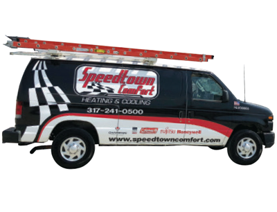 Speedtown Comfort Heating and Cooling
Speedway, Ind. | 2 vehicles
Jerry Wilson, owner
Just outside Indianapolis, and a stone’s throw from the famous Indianapolis Motor Speedway, sits the town of Speedway, Ind. And with close to 36,000 motor sports employees in the area, it’s no secret who Speedtown Comfort Heating and Cooling is targeting.
“We can never take care of 36,000 people,” says Jerry Wilson, owner of Speedtown Comfort. “But if I get 1,500 of those, over the next however many years of us building this business, and keep them, we’ll never need for customers.”
When Wilson started the company with his father, he had a vision for the look he wanted for his trucks. He sketched out his ideas and sent them to a local graphics company, who refined it and came up with the final design.
“Even before I had the logos on my truck, just our black, red and white striping and scheme made people stop and ask me about the company,” he says. “The racers to whom we market … they all think it’s just the coolest thing ever.”
As a small, two-man operation that recently hired it’s third employee, Speedtown Comfort doesn’t have a large marketing budget. What money Wilson does spend on marketing is all focused on the motor sports arena.
“The overall design and logo has helped us become familiar and recognized by the motor sports community in central Indiana,” Wilson says. “We have had people become customers just from seeing our van or truck on the road or in customer’s driveway.”
Wilson also takes great pride when he pulls into the supply house and gets comments from other technicians who say they wish their employers put as much thought and effort into looking professional.
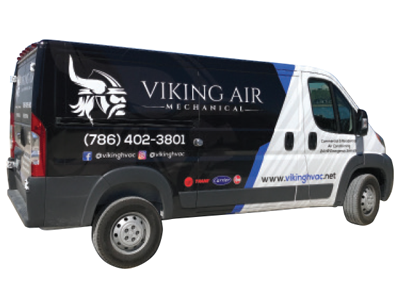 Viking Air Mechanical
Miami, Fla. | 4 vehicles
Mike Granobles, owner
As a self-taught graphic designer, Mike Granobles knew he wanted something that stood out and had clear contrast to be able to see all the text clearly on his commercial company’s vans.
“I used colors I liked and often times see in this industry,” Granobles, owner of Viking Air Mechanical, says. “It’s definitely a change from the norm in my region, where every square inch of space is filled with some sort of air handler, condenser and text all over.”
The striking Viking logo against the black van with white and blue accents certainly stands out in Miami, Fla., and it’s paying off for Granobles.
“We’ve received a lot of calls strictly off just our vans,” he says. “I haven’t gotten a response like this in any other form of advertisement.”
An added benefit of the new look, implemented nearly a year ago, is the buy-in from Viking Air Mechanical’s employees.
“They feel very prideful that they are driving the van and working for our company and are oftentimes complemented on the design,” Granobles says. “They love it!”
When all is said and done, Granobles is happy with the way it turned out and wouldn’t change a thing.
June 2026 Products
June 2026 Products
June 2026 Products
June 2026 Products

June 2026 Products