
Fleet vehicles are the main — if not only — investment many contractors make in marketing. It’s an important line item in the budget to leave to chance, and smart contractors know how to make the most of their rolling billboards.
It should go without saying, your fleet needs to quickly stand out. You have between four and 10 seconds to convey your message to other drivers. On the flip side, you want your vehicles to make a lasting impression when parked in a customer’s driveway or parking lot.
“Great truck design is a perfect balance of three elements: imagery, vibrancy and legibility,” says Joseph Kalinowski, creative director for the Content Marketing Institute. “The combination of the three will undoubtedly make a recognizable and memorable vehicle.”
Over the years, more and more contractors are investing in creative, eye-catching designs to set their fleets apart from the competition, which consistently elevates the quality of entries in our annual Tops in Trucks Fleet Design Contest.
This year’s winners — Hurlburt Heating & Plumbing, Krinkie's Heating and Air and Tin Man Heating & Cooling — perfectly illustrate what it means to leave an impression.
When it comes time to rebrand your company, many smart contractors start with their most visible asset — their trucks — and go from there.
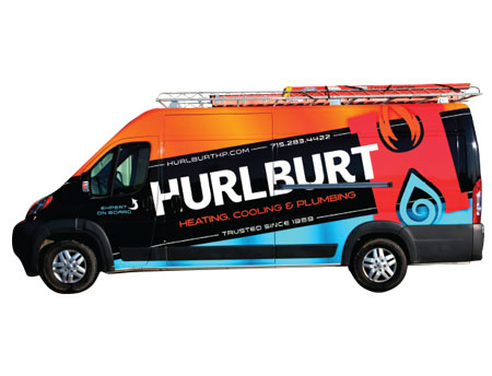
“Our new truck design is part of a larger re-branding effort by our company,” says Greg Mericle, president of Hurlburt Heating & Plumbing. “As a matter of fact, these wraps were stage one.”
Because of the mobility of the vans, Mericle and his team felt it was a great way to get the new design out in front of the public’s eyes.
Hurlburt first began unveiling the design on its vans in April 2016, and currently have five newly wrapped vehicles with plans to upgrade the entire fleet.
“The colors for our design came about as a matter of our design goal,” Mericle says. “We wanted an attention-grabbing billboard that could be seen from a great distance.”
While some contractors might be hesitant with the price tag associated with designing and wrapping their fleet, Mericle didn’t blink. He believes its money well spent.
“When compared to other forms of physical advertising, the cost per impression is incredibly low,” he says. “And we’ve seen considerable return from our new design.”
Hurlburt’s bold design helps set them apart from their competitors and they gain new customers every day who site the company’s vans as a reason for calling.
“Our customers love the new design and I’m pretty sure they’d be willing to pay more just to have one of our vans parked in their driveway,” Mericle says. “Our employees are incredibly proud of the new design too.
“They love the added attention they get when driving around town,” he adds. “I think it helps present them as the professionals they are and I want to do everything I can to highlight that professionalism.”
Mericle initially hired a design firm who presented several concepts, none of which possessed the elements he was after. Finally, he enlisted the help of the graphics team at Service Nation Alliance. The resulting graphics feature bold, contrasting colors that stand out from other vehicles on the road, centered on the company’s iconic “H” logo.
“Our vans are branding vehicles as much as they are service vehicles,” Mericle says. “Our company name in massive bold letters running at an angle down the entire length of the van is our best design element.”
If given the chance to start over with the design, Mericle says he wouldn’t change a thing.
“It was a long road, with many revisions along the way,” he says. But, we absolutely believe it’s a home run.”
>> View additional photos of Hurlburt's fleet
Contractors who have been around for a while know the importance of name recognition and, when you’re designing a new look for your fleet, you don’t want to lose that brand equity.
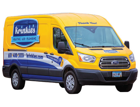
“We wanted to be different from what we were for the last ten years, but not so much that we looked like strangers to our clients,” says Jeff Madison, general manager of Krinkie’s Heating, Air Conditioning and Plumbing in St. Paul, Minn. “The idea for the vehicle design came from a number of sources.”
Having recently ended a 10-year term with a national franchisor, Krinkie’s was faced with a branding challenge of balancing the old with the new … without losing who they were.
“With the new logo, we wanted to incorporate the original Krinkie’s logo that was used from 1981-2006, and balance it with the look our clients had become accustomed to seeing the last 10 years,” Madison says. “The result is a perfect blend of the company’s original colors with our more recent colors scheme.”
With a complete rebranding, Madison knew it wasn’t going to be cheap. Instead of rolling out the new design on a couple of vehicles and slowing incorporating it as new vehicles were purchased, Krinkie’s needed to do it all at once.
“We invested nearly $10K in design and $20K in fabrication, preparation and installation on our fleet,” he says. “Where I’ve seen a huge return on this investment so far, is the pride and ownership the technicians have over their vehicles.”
Madison says the technician’s take pride in keeping their vehicles clean and neat and, when they stop for lunch, they park near a busy intersection just to make sure the trucks are seen.
“We’ve had some tremendous response from some of our clients as well,” Madison says. “One of our technicians even had a CSR who used to work in our office flag him down so she could tell him she loved the new truck!”
The most important part of the design, Madison says, was actually the idea of the owner himself, Bruce Krinkie.
“I wanted to put the words ‘Thank You’ above the windshield,” Krinkie says. “We went back and forth on whether it should read forwards, or backwards so you could read it in the rearview mirror.”
They settled on making it so you can read it looking at the van — it’s the first thing Krinkie’s clients see when they watch the truck pull up to their home, and the last thing they see when they watch the technician get back in the truck to leave.
“I didn’t realize how great this was going to look until I saw it from our clients’ perspective,” Madison says. “While in a clients’ home with a technician, I looked out their large living room window and what stuck out the most was our vans telling the client thank you.”
>> View additional photos of Krinkie's fleet
When your company already has an interesting name and a unique logo, designing a vehicle wrap around it can be a difficult task.
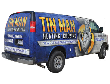
“When I hired a design company to come up with a wrap, I initially said I was open to changing our logo,” says Jeff Zuhlsdorf, president of Tin Man Heating & Cooling, Inc. in Bowling Green, Ohio. “But after looking over the options they sent me, I knew that wouldn’t work.”
Instead, Zuhlsdorf offered some opinions on how to design the wrap around his iconic Tin Man logo. After some back and forth, they hit jackpot with innovative and memorable graphics.
“I wanted to get away from the red, white and blue you see on so many HVACR companies,” Zuhlsdorf says. “Not only does that make us stand out, but no other company in our area even has wrapped vehicles.”
Tin Man is still in the early stages of its rebranding effort — with one van wrapped in the new design, one currently being wrapped and one more set to be wrapped this Spring.
Prior to this, the company’s only branding campaign was its Tin Man logo, which was also the only graphic on the side of its white vans.
“It’s too early to tell what kind of return we’ll get on this investment, but I can say that we’re turning a lot of heads when our truck drives down the road,” Zuhlsdorf says. “We’ll continue to incorporate the new design as we upgrade the rest of our fleet.”
Zuhlsdorf says he’s heard from customers who think the new look is creative and unique, and his technicians are looking forward to getting new vehicles so they can show off the bold design.
“We’re a small company making a big impact in our area with forward thinking,” Zuhlsdorf says. “We grew nearly 37 percent last year with 15.6 percent profit — if I could start all over again, I’d have wrapped my fleet a lot sooner than I did.
>> View additional photos of Tin Man's fleet
Simplicity is the key to an outstanding vehicle design — you have to get your message across without cluttering up the side of the van with too much copy.
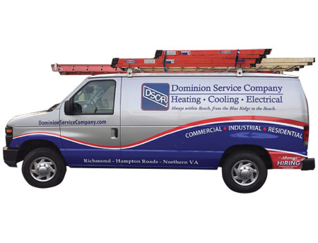
“If you look at our old trucks, you’ll definitely see too many words describing everything we do,” says Chase Tunnell, president of Dominion Service Company in Richmond, Va. “We decided our new design needed to be simple and refined.”
Tunnell started the same place most companies do — with the logo and his favorite color.
“Blue has always been a favorite color and prominent in our logo over the years,” he says. “We added the red to give an extra ‘pop’ during the re-design.”
Tunnell says he already had a basic idea of what he wanted the vans to look like, but turned to a creative firm to help translate it to a working design. It’s professional, simple yet bold, clean and powerful.
Dominion’s design is bold enough to catch the eye of prospective customers, while the cleanliness and professionalism of it instills confidence in the minds of employees and existing customers.
“When you’re rebranding, the fleet is the most expensive thing to change,” he says. “So you have to make sure the design works there first. Everything else is relatively easy to update.”
Keeping your fleet looking its best is certainly an investment. And, the larger the fleet, the more expensive it can be to wrap new vehicles year after year. When Robert Hutchison, the designer with whom Tunnell had been working, was looking to go off on his own, Tunnell crunched the numbers.
“I looked at how much we paid for each truck wrap versus how much it cost wholesale, and weighed that against the cost of investing in Hutch’s startup,” Tunnell said. “What I realized is, that investment would pay for my fleet rebranding, and any other business Hutch pulled in would be profit.”
The result was Six-Eight Creative, a custom vinyl graphics shop owned and operated by Dominion Service Company.
>> View additional photos of Dominion's fleet
When you’re a start-up company, everything you do is from scratch — including your fleet graphics and company branding. Sometimes, that can be a challenge. The beauty of it is, you can do whatever you want.
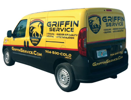
“We want an upscale, high-end clientele, so we modeled the colors and look after the Ferrari emblem and colors,” says Wade Taylor, president of Griffin Service in Saint Johns, Fla. “We originally were going to do green, blue and white, but after bouncing ideas off family, friends and a business coach we decided to go a different direction.”
The yellow and black design, with a touch of red, Griffin settled on was no accident. Taylor and Tom Casey, chief quality officer, did extensive market research.
“We took pictures of every work van and truck we’d see in our area and put them on a poster board in the office,” Taylor says.
“We set out to design something with colors and graphics that absolutely no one in the area had.”
Although their fleet is small (for now), it leaves a lasting impression. The company receives comments all the time from people saying they see their trucks everywhere and they can’t miss them.
“I’ve had people ask to let them drive one so they can advertise for us,” Taylor says. “I may soon put together that program.”
>> View additional photos of Griffin's fleet
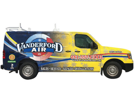
Nine years ago, one of the Tops in Trucks Fleet Design Contest runners up was a bright blue truck with snowflakes and a red ribbon running through the Vanderford Mechanical logo. This year, rebranded as Vanderford Air, the updated design is yet again among the best.
“We wanted to standout and be identified just by glancing at our vehicles, so we added a bright yellow that faded into our original blue color,” says Robert Vanderford, president of Vanderford Air in League City, Texas. “Having the snowflakes in the design has been a trademark design since we started having our vehicles wrapped.”
Vanderford originally came up with the design in 2006, and has made tweaks and improvements through the years. Recently, the company changed the name from Vanderford Mechanical to Vanderford Air, due to confusion on what services we provided.
“We designed a new logo at this point along with a color scheme that popped more,” Vanderford says. “We actually held a competition among designers for the logo, and involved our employees in the process.”
Vanderford says his employees love driving the vehicles, which he believes adds another level of professionalism to their job.
“Professionally identified vehicles and professionally identified work uniforms help portray the expectation of professionalism that customers deserve,” he says.
Like in many areas of your business, you grow and make changes for the better.
“I read HVACR Business every month, and always enjoy seeing the Tops in Trucks Fleet Design Contest,” Vanderford says. “Every year the designs get better and more creative … it’s motivated me to make changes and design upgrades.”
>> View additional photos of Vanderford's fleet
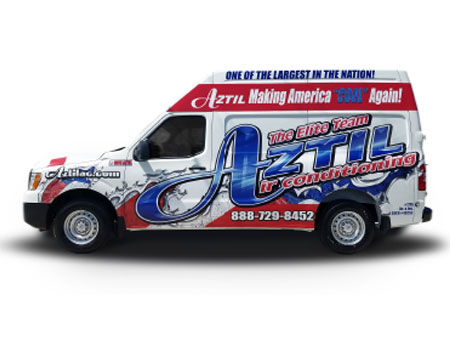
Many contractors use their fleet as the primary marketing initiative, but when you have more than 100 vehicles on the road — each with a unique design — you’re really making a statement.
“The big Aztil logo is consistent on all our trucks, but each one has a 100 percent unique design,” says Louis Lionelli, owner of Aztil Air Conditioning in West Palm Beach, Fla. “I got tired of not standing out, so I decided to go the opposite direction and make sure every single truck was memorable.”
Many of the trucks in Aztil’s fleet feature specific themes. So, when there’s a community event, Aztil sends a truck that ties in nicely. Whether it’s a holiday, a season or simply patriotic (such as the company’s voting themed truck), Aztil has a truck to fit.
“More than half our new customers refer to our fleet marketing campaign as the reason why they called,” Lionelli says. “And customers get excited to see what the next design will be — many of them call the office simply to compliment us on a truck they saw.”
The excitement from his customer base is what motivates Aztil to continue to take its designs to a higher level. That excitement is also reflected in the pride, attitude and workmanship of the company’s employees.
“The uniqueness of our designs forces everyone to look at our fleet,” Lionelli says. “You will never forget Aztil’s truck once you’ve seen one.”
>> View additional photos of Aztil's fleet
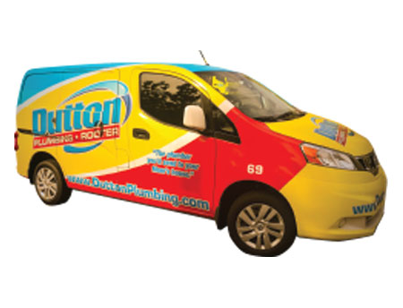
Like most companies, Dutton Plumbing’s trucks were basic white with a blue and red logo on the side. Nothing special and nothing memorable about them.
“I wanted our trucks to be visible, so we did some research on what the most visible colors are,” says Eric Dutton, owner of the Simi Valley, Calif. based company. “We went with bright yellow, which really looks great with the blue and red logo.”
Initially, Dutton contemplated going with high-visibility safety yellow, but nixed it when he saw that it clashed with the company logo.
“The concept was created and implemented for all of our marketing and branding collateral simultaneously,” Dutton says. “It takes you back to your childhood … with the primary colors reminding you of the old Legos you had as a kid.”
Another element of the design on some vehicles that elicits happiness is the image of puppies, as well as the catchy company slogan: The plumber you’d send to your mom’s house.
“Our general manager always attaches pictures of puppies to his emails,” Dutton says. “So, when we wrapped a truck for him, we put some puppies on it.”
The response from customers was so great, Dutton added puppies to another truck and have begun giving away stuffed puppies at different community events.
From the puppies to the bright colors to the slogan, everything Dutton does comes across as fun. And that’s exactly the kind of company he’s created for his employees and customers.
>> View additional photos of Dutton's fleet
To download an entry form for the 2018 Tops in Trucks Fleet Design Contest, visit hvacrbusiness.com/topsintrucks.
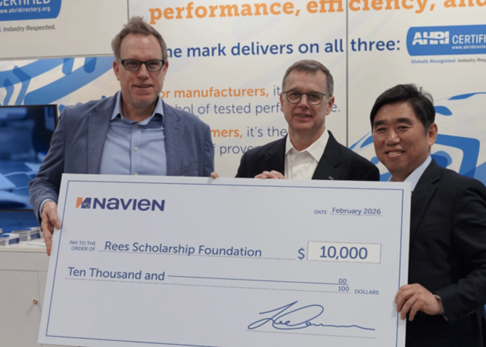
April 2026 HVACR News
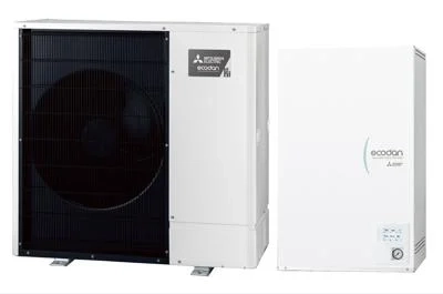
April 2026 HVACR Products
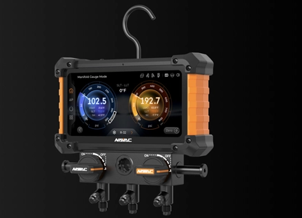
April 2026 HVACR Products
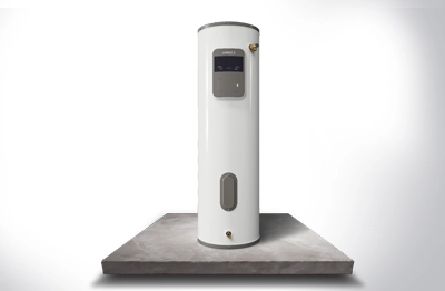
April 2026 HVACR Products
April 2026 HVACR Products