
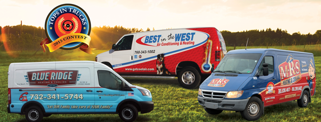
Our Tops in Trucks Fleet Design Contest is an annual salute to outstanding fleet vehicle graphic design. It's our way of recognizing contractors who are on the leading edge of effective marketing. Winning fleet vehicles are featured each June on our cover.
Throughout the past decade, service vehicles have continued to evolve from the boring, white van with black lettering into the attention-grabbing mobile billboards you see driving around city streets every day.
Savvy HVACR contractors are moving away from the tired old sunshine and snowflake designs that have long been associated with heating and cooling, opting instead to spice things up with a fleet design that will leave a memorable impression with customers and potential new business.
This year's Tops in Trucks Fleet Design Contest winners are no exception — Best in the West Air Conditioning and Heating, Blue Ridge Heating and Cooling and M.R.S. Heating and Cooling have all transformed their forgettable, drab trucks into the impressive fleets that caught the attention of the judges for all the right reasons.
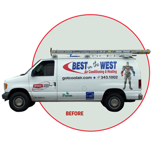
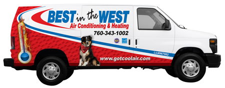 For nearly 10 years, Richard Weaver's fleet has had the same design. But, early in 2014, he knew it was time for Best in the West Air Conditioning and Heating to go with something new.
"It took us a while to come up with what we were going to do, but it was worth it," he says. "I knew, basically, what we wanted to incorporate, but our design firm was able to put it all together."
Aside from the logo, which is encapsulated by a red boomerang, Weaver had only two other requirements for the design: it had to stand out, but not be over-verbalized; and it had to include his dog Memphis.
"When we lost our previous dog, we decided to do a promotion with a local animal shelter where we gave away a 16 SEER unit," Weaver explains. "It was really popular, and we realized we had a lot of clients who also loved animals."
It was Weaver's wife who suggested they put their new dog, an Australian Shepherd they rescued about a year and a half ago, on the vans.
"When you look at the dog as you pass by the van, the head seems to follow you," he says. "I didn't know it was going to do that until it was done, but I thought that was cool."
 Customers enjoy the optical illusion too, often walking or driving back and forth past the vans just to watch Memphis "move."
On their old trucks, Best in the West used some red, with mostly blues and white. So, when the designer presented Weaver with a mostly red design, it was a bit of a shock.
"When we saw this design with all the red, it practically jumped off the paper and we knew it would look great on our vans," he says. "From far away, you can read the van and see who we are and how to contact us, but up close the detail is amazing."
Weaver says the new design, and especially Memphis, have had a huge impact on referral business, with many new customers calling for repairs simply because they're animal lovers. Because of this, he plans to use his dog on other forms of advertising too.
"If you don't advertise, it's like blinking in the dark," he says. "You're the only one who knows what you're doing."
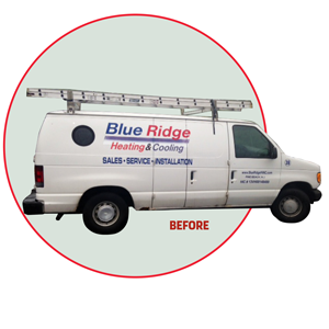
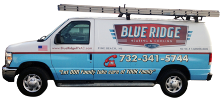 Jennifer Stueber and her father Bill talked about wrapping their trucks on and off for about a decade. Finally, about nine months ago, after taking a business development course together, they decided to make the investment in updating the brand for Blue Ridge Heating & Cooling.
"Change can be very hard to deal with," she says. "My father had a very difficult time, because he spent 20 years building what we had. But, every company that's been around a while eventually changes with the times."
It started with the company logo, which then turned into a redesigned website and, eventually, new wraps for the fleet. Because Blue Ridge has an open book policy with employees, bringing the team into the design process seemed natural.
"Our whole team was involved," Stueber says. "Our change has actually helped our team grow very close together in a positive way."
Like many companies, Blue Ridge has a mutigenerational workforce, and getting everyone to agree on a company design was a process.
"We have an age gap, whereas the younger employees wanted something modern and the older employees wanted something old fashioned," she says. "We did a lot of research on other trucks and the consensus was that we wanted something that was retro, but also modern."
Jennifer's father, who started the company in 1986, believes in the good old days where companies provided excellent customer service. That's something everyone agreed was an important point to emphasize.
 The vans have a sleek, modern look, while still conveying that old fashioned feeling, captured perfectly in the company logo and the graphic of the red, rotary dial phone.
"The people who remember those red rotary phones are a lot older, and my generation doesn't even know what those are," Stueber says. "Of course, I know about them because we have one, because my dad likes to keep old things."
In fact, her father's collection of "old things" was the inspiration for the company logo — displayed in the Blue Ridge office is a collection of vintage furnace tags, which Stueber used when working with the graphic designer.
In less than a year, Blue Ridge has gone from plain white vans with a lot of words on them to a complete rebranding and wrapped trucks — an expensive endeavor.
"You truck is the absolute best form of advertising you can have, because it's constantly on the move," Stueber says. "All day, all night in different neighborhoods — you need it to be the best it can be. It costs a lot of money, but it's worth it."
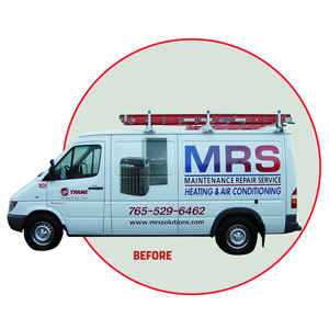
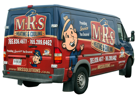 Accepting change has also been difficult for Darrell Gross, who has built his company brand for the last 20 years as first a commercial repair company to now a mostly residential service company. But, having done work at restaurants and hotels, Gross learned a lesson from them and knew it was time to rebrand his company, M.R.S. Heating and Cooling.
"I've read HVACR Business for many years and always enjoy looking at the Tops in Trucks contest winners," he says. "This was a goal of mine. When I started this rebranding process, I told my team it would be nice to be a part of that group of winners."
Like many companies, M.R.S. Heating and Cooling's vans were white, with the main graphical element being the lettering. When Gross contacted an Indianapolis design firm for help, they went back and forth about five times before he was happy with the concept.
"It's a little scary to go away from what you're used to," Gross says. "I wanted to stay with the red and blue theme, but wanted a fresh take on it."
One of the most important elements, from a branding standpoint, Gross believed was the new company logo. It had to be something that could stand well on it's own, separate from the character that appears on the trucks.
 "We started off trying to mirror a lot of designs that I liked, but nothing really worked," he explains. "So we scrapped it all and came up with something uniquely ours."
Gross knew, with a fleet of 16 vehicles, wrapping all of them would be a major expense. This past November, he wrapped an initial six trucks as a test run to gauge the feedback. Since then, he's wrapped four more.
"I'm simply amazed at how well it's received," he says. "I hear people talking about it all the time. People who have never called us before are calling us. They love the logo and they want to talk about it."
Gross says it's not uncommon for someone to call up and say, "Our AC is out, and we really love the look of your new trucks." By year's end, he plans on having all 16 vehicles in his fleet wrapped with the new design.
"Our employees see the investment we're making in the company and it gives them peace of mind," Gross says. "It shows them how serious we are about the company and how serious it is for us to project that professional image."
You don't see many commercial, new construction HVAC companies with flashy wraps, and Gregg Zinsmeyer's company was no different for 23 years. But, when he purchased a new 20-foot box truck to run supplies from jobsite to jobsite, he figured it was time to get the name A/C Technical Services out in the public eye.
 "My wife and I own the company, and we realized we had a rolling billboard with nothing on it," he says. "We'd always toyed with the idea of doing a wrap, so we decided to go ahead and do one on the box truck."
As Zinsmeyer moved ahead with his wrap plans, however, he realized his 23-year-old company logo was kind of boring, so he looked for inspiration.
"After looking at last year's Tops in Trucks contest issue, we decided to contact a design firm to help us with the wrap," Zinsmeyer says. "We started with the intent of wrapping the box truck, and ended up rebranding our entire company in a matter of about six months."
Zinsmeyer says they're about 90 percent complete with the entire process, with a new logo, uniforms, business cards and three of the company's vehicles wrapped.
"It's a costly ordeal, but that's a part of doing business," he says. "It really stands out. A lot of our customers say it's some of the best graphics they've seen."
A/C Technical Services' customers have responded to the colors, which they say are very pleasing to the eyes, with lettering that's readable at a glance, even from a distance or with the vehicle in motion.
"Too many times companies make the mistake of putting too much information on their wraps," Zinsmeyer says. "Ours is clear, concise and has a phone number. That's all you need."
Scott Newgaard knew it was time for a change, and he wanted his trucks to stand out during dark, cold Minnesota winters. He also knew Bloomington Heating & Air's plain white vans simply weren't doing that.
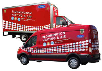 "We were looking for a marketing concept that was outside the traditional heating and air industry," Newgaard says. "My wife Stacy came up with the initial concept, and a marketing firm provided us with a designer to work with to make that concept a reality."
The final result is a bright red truck with a huge dot wave design that seems to flow like air, catching the attention of everyone who sees it.
"In addition, we spent money to have the business name, logo, symbols, website and phone number all created in reflective material on the vans," he says. "Our trucks are glowing and visible for all to see in all seasons, day or night."
One of Newgaard's goals for the fresh design was to be something that would not only resonate with customers, but also showcase nice on his vehicles, social media accounts and marketing collateral.
"We had a fleet of white vehicles in the past with some fairly simple door signage," he says. "We felt it was of utmost importance for customers to immediately know what we do by looking at our name and logo, and for us to be recognizable and professional when our technicians arrive on the jobsite."
After selling his previous HVACR company in Florida, Jeff Carlin moved to South Carolina and decided to start a new company. A year after starting Expert Air, Carlin knew it was time to make his fleet look more professional.
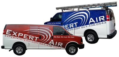 "A customer isn't going to spend $15-20,000 with you if you look like you just started up," he says. "We needed a professional looking truck that projected well with customers."
When trying to decide on a color scheme for Expert Air, Carlin wanted a twist on the typical blue and red used by most HVACR companies.
"Those colors are pretty standard in our industry, and a lot of people associate them with cooling and heating," he says. "We wanted to do our trucks in either all blue or all red, but instead we decided to make one side red and the other blue."
Whether you're looking at his vans from the left or the right, the bold color choice certainly pops. And, as an added bonus, Carlin's small fleet of three vehicles sometimes appears larger than it is.
"A lot of people, because they only see one side or the other, think we have both blue vans and red vans," he says. "Most of the time, they're seeing the same van and not realizing it."
As Expert Air continues to grow, Carlin plans to add two more vehicles to his fleet within the next year. And the first order of business is to wrap them.
"Conveying who you are in your service van is important," he says. "For many companies, especially start-ups, their vans are their only form of advertising and its important to project a professional image."
After 34 years in business, building a reputation as a modern, efficient, warm company that customers can count on, John McMillan realized his fleet of white vans with black lettering was starting to blend in and get lost. It was time to make Hearth and Home Heating & Cooling look sophisticated too.
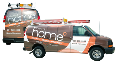 "I didn't want to look like everyone else," McMillan says. "When you pull into a subdivision, it doesn't blend into anything. It's a very noticeable truck. I also had safety in mind for our technicians, and you can see that orange a mile down the road. It's a softer orange, but it pops."
McMillan already had his logo, which incorporated the degree symbol from his slogan, "higher degree of comfort," as well as the color scheme of brown and orange.
"I used a design company to incorporate that logo and color scheme for our trucks and the rest of our branding," he says. "We went through a few designs before we hit on the one that worked."
One of the main goals McMillan had in coming up with the design for his fleet was to appeal to women.
"Typically, they're the ones at home when we come and we've found they really make a lot of the decisions," he says. "We didn't want something too harsh or too mechanical. We didn't want to clutter it with everything we do either."
When Ken Goodrich took over a struggling Las Vegas air conditioning company last year, he decided he wanted to do something completely different — and that included the look and feel, and even the name, of the company.
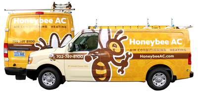 "I wanted a new look," he says. "I wanted completely different colors than the industry norm. I wanted completely different. Every piece and process of this business, I'm reinventing."
After working with a branding agency, the initial concept that stood out to him was the name Queen Bee.
"Because we know 70 percent of our customers are women, they're our target market," Goodrich says. "But as I surveyed our management and technicians, no one wanted to work for a company called Queen Bee."
Goodrich didn't give up on the bee concept, deciding instead on Honeybee AC.
"I've called the love of my life Honeybee since I met her, and I thought that was a good compromise," he says.
Of course, Goodrich also did his homework. He didn't settle on Honeybee AC simply to be different. The more he learned about honeybees, the more he knew it was a perfect fit for the message he wanted his company to convey.
"Did you know the honeybee is the only being on earth that has an internal refrigeration system?" he says. "Honeybees also control the temperature of their hives by fluttering in unison to get the air flowing."
Rather than trying to serve the entire Las Vegas market, Goodrich is using Honeybee's unique brand to target specific areas.
"We have a storefront in a shopping plaza with Whole Foods," he says, "so our trucks and signage will be very visible to that clientele."
Initially, Chris Hunter's fleet was like everyone else's — white trucks with lettering — and he thought he was doing everything right. But, after attending a business seminar that inspired him to claim his market niche and find out who his company really was, Hunter Heat & Air's super tech was born.
 "We went back through customer comments, and many of them spoke to our speed and professional service," he says. "The super tech emphasizes our fast, professional service."
When you look at Hunter's fleet of 17 vehicles, it's obvious they all go together. But, if you look closely, you'll see something unique that Hunter Heat & Air does.
"Each vehicle we do is slightly different, so each is unique with the same theme," he says. "We're the first company in our area to brand the entire fleet, and it's made a huge impact."
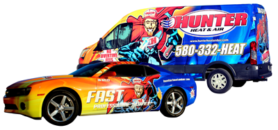
One vehicle that really stands out is the Hunter Heat & Air wrapped Camaro. It's the one many people ask to stop and take a photo with, and the one any employee is able to drive.
"We needed an office vehicle, and I was initially going to buy a truck," Hunter explains. "But I saw a used Camaro for a great price and thought, fitting with our theme of fast service, putting a wrap on it would be great publicity."
Anybody can drive it, he says, with the only rule being he doesn't want to see a picture on Facebook with a cop behind it.
"This is the biggest investment we've made," Hunter says, "because we want people to think of us when their air breaks, because we can get there fast."
 Pete Grasso is the editor of HVACR Business magazine and the Ahead of the Curve enewsletter, as well as web content editor for www.hvacrbusiness.com and author of the blog Keeping it Simple.
June 2026 Products
June 2026 Products
June 2026 Products
June 2026 Products

June 2026 Products