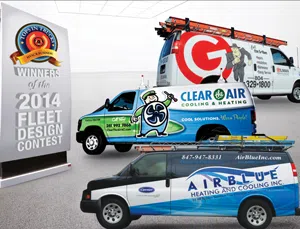
In the eighth year of the Tops-in-Trucks Fleet Design contest,HVACR Business received a record number of entries and a marked improvement in the quality of designs from years past. The competition was as close as it’s ever been, with many of the entries garnering respectable scores from the judges.
Company vehicles are the main source of advertising for many HVACR contractors. And when that’s the case, the trucks better feature high quality, compelling vehicle graphics. HVACR contractors also must realize that an investment of several hundred to a few thousand dollars per vehicle means there’s little room for error.
Bold designs dominated the field, making a lasting impression on the judges as they scored each and every submission. In the end, only a few were memorable enough for a closer look — and that’s when the judging really got serious.
Clean design, legible, eye-catching, great layout, strong colors — these are some of the descriptions this year’s winners received in the judging process. Above all, however, the 2014 Topsin- Trucks Fleet Design contest winners’ designs were simply brilliant.
When Konrad Rybak came up with a design for Air Blue’s truck wraps in 2010, he thought for sure he had the best design out there. But, he knew something was lacking, and it wasn’t information.
“Your company name, your phone number and your website are the most important,” Rybak says. “The rest of the stuff, people already know.” The cleaner the better, Rybak believes. And that was the mistake he made with his first design. Earlier this year, he set out to make his trucks stand out better than before and enlisted the help of Road Rage Designs.
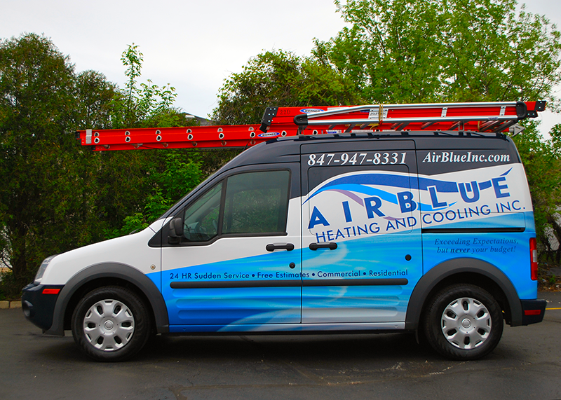
The result was a clean, professional looking design that’s eye-catching, but straight to the point. The judges especially liked the colors and the extremely legible design.
“I wish I would have done this design first,” Rybak says, “instead of including so much information on that first design.
While he’s still in the process of wrapping his fleet with the new design, he’s already seen it pay off. The eye-catching trucks attract customers, he firmly believes, as many of the calls they receive reference their trucks.
A two-tone blue color separated by a thick white stripe and the prominent Air Blue logo dominates the vans. The company phone number and website are also highly visible in the design.
While a lot of ideas were floated back and forth between Rybak and Road Rage Designs, Rybak felt it was important not to stray too far from the previous look of the truck.
“There’s something to be said for brand recognition,” he says. “Our logo has been the same since I started the company in 2006, and this new truck is recognizable as one of ours — a cleaner, simpler truck.”
Jason Stom needed to redo his company’s website and, as is often the case, one thing led to another. The result was a complete re-branding of Clear the Air, including their new winning truck wrap.
“We weren’t planning to do a truck design,” Stom says. “But after speaking with Dan Antonelli at Graphic D-Signs, we decided to go all in.”
![]()
Started in 1990 by Stom’s father, Clear the Air had the same look since the beginning. About the only thing that stayed the same was the name of the company. Everything else was refreshed (though the colors are similar to the company’s old look, they too were tweaked).
“What I really wanted with this new look was to harken back to the days of when companies truly provided service,” Stom says. “I wanted a vintage feel, but it had to be modern as well.”
From the colors to the fonts to the new mascot with his cap, everything about Clear the Air’s new look accomplishes Stom’s goal. The legible text and clean design were key factors in the judges’ selection of Clear the Air.
“At first, it took a while for us to warm up to because it was so different than what we were used to,” he says. “The little guy is so jolly and friendly looking, and that’s what we all felt when we looked at it. I warmed up to it the more I looked at it.”
The company name and mascot dominate the bold design on the truck, something Stom says is already paying off in a big way.
“The second day our new trucks were on the road, we had two separate incidents where neighbors came over to where our guys were on a job and asked us to do business with them,” he says. “It’s just very eye-catching and people respond to it all the time by striking up conversations with our technicians.”
Stom relied on the expertise of Antonelli and Graphic D-Signs to help him not get caught up in the little details, something he says was an important part of the process. He advises other HVACR contractors to cement their brand presence right away, instead of inching into it like he did. “The brand is bigger than a logo,” Stom says. “It’s the colors, the culture … everything. And your trucks are a big part of your advertising, because they’re always driving around town.”
Seven years ago, Winston Hancock hired a marketing firm to help rebrand Gilman Heating & Cooling, the result of which was a big G logo. The G was certainly bold, and employees and customers began to refer to Gilman as the “G-men.” About a year and a half ago, Hancock realized it was time to take it a step further and hired Mediagistic.
“When we switched to Mediagistic, we were looking for a whole new look and feel for everything,” Hancock says. “The biggest thing they did was rework the G logo and come up with the G-man mascot.”

These two bold elements dominate Gilman’s truck, making it stand out from the crowd and earning it a spot as one of this year’s winners. The judges remarked on the eye-catching visual on the trucks as something that made Gilman stand out.
“Mediagistic brought our ideas to fruition and breathed life into our beloved G-man,” Hancock says.
Gilman was founded in 1917, and Hancock believes the G-man character has made it easy for them to tell their story, giving their customers a memorable mascot to associate with their company.
“Children also relate to this sort of superhero we’ve created,” Hancock says. “Also, the bold colors and the way the oversized G is placed on our vans makes a lasting impression with everyone who sees it.”
As with all the winners of the Topsin- Trucks Fleet Design contest, Hancock says his company is seeing a tremendous return on investment. Gilman has experienced an increase in the amount of sales and service leads, all based on customers seeing their vans around town.
“The investment in adding the G-man with our symbolic, oversized red G gives our vans a head-turning appeal that makes us memorable,” Hancock says. “Our fleet is definitely a rapidly growing community icon.”
Paschal’s simple, yet bold design garnered plenty of votes from the judges, who liked the way the logo was incorporated into the design without much else to clutter it up.
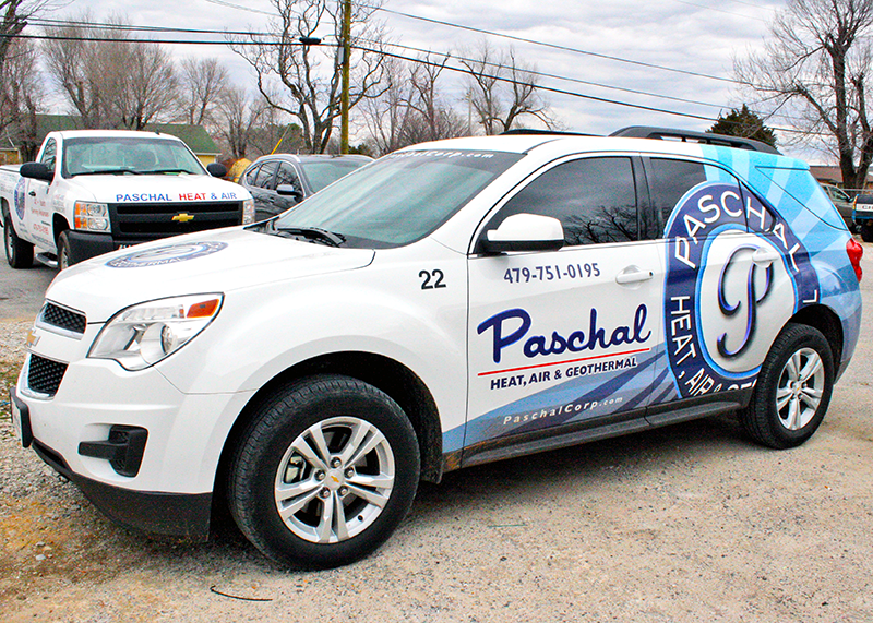
“Our idea for our fleet design was to keep things simple and clean,” Boyce says. “We wanted to bring awareness to our brand by incorporating elements of our logo and nothing else.”
Boyce recently took the reigns of the 45-year-old company and knew he needed to refresh the company’s brand.
He hired an in-house marketing coordinator with a graphic design background and let him use his expertise.
The result is Paschal’s immediately recognizable vibrant blue logo and clean truck design (which was narrowed down from 15 and voted on by the employees).
“We see a lot of competitors with cluttered designs that aren’t readable in the few seconds in which you might drive by,” Boyce says. “Our simplicity and clarity are most important to our design.
Though Rosenberg Indoor Comfort is only 11 years old, the family has been in the business in San Antonio since 1970. Michael Rosenberg realized that kind of name recognition was important when he decided to wrap his trucks earlier this year.
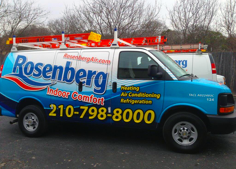
“Our name is our brand, because so many people associate our name with what we do,” Rosenberg says. “The same colors have been used over the years, but this new design adds a lot of pizzazz to the old design.”
This is the first time Rosenberg has wrapped his trucks, having previously painted and lettered them.
“Our old truck was very Plain Jane,” he says. “It didn’t stand out. It was very mechanical and boring.”
The result of the new design effort features a Wow factor San Antonio might not be used to from Rosenberg, but one that is paying off in increased calls.
The judges loved the way the phone number is prominently featured, something Rosenberg admits is something people don’t forget after seeing it.
Out of the myriad entries we received, only a few could be winners. That isn’t to say others didn’t stand out. Three in particular the judges felt deserved special recognition, based on uniqueness in their use of design.
“One day, I was sitting at an intersection and saw maybe five different HVACR company vehicles,” Barnes says. “They all looked the same — very plain. Nothing stood out.”
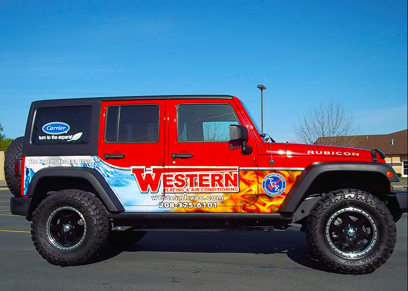
That’s when Barnes decided he needed to do something about his fleet. He worked with a graphic designer to blend together the fire and ice background for his wrap, then developed the placement of his logo and text.
The result was a design that turns heads when sitting in traffic, but the judges really like the way Barnes modified the wrap for his personal vehicle, a Jeep Wrangler Rubicon.
“I’ve always put my logo on my personal vehicle,” Barnes says. “When I purchased the Jeep, I decided to put a half-wrap on it because I didn’t want to lose any of the advertising when I took the top down in the summer.”
The look has gotten so many compliments that Barnes purchased an additional Jeep for his sales staff to use.
“It’s an incentive for them,” he explains. “Whomever has the best sales for a certain period gets to drive it for the next sales period, and so on. They love the contest and they love driving it.”
Among all the entries, it’s difficult not to notice the big Woodfin fuel transport trailer with it’s clear communication of the Woodfin brand.
It all started when Andress realized his company’s vehicles were being underused as rolling billboards. A new logo and image standards were immediately developed and applied to his fleet wrap.
“We didn’t fall into the trap of making an overly busy wrap, showing a multitude of pictures simply because we could,” Andress says. “The color gradient is unlike anything else in the market and makes us noticeable without the need for our customers to make an effort to see us.”
A true measure of the new Woodfin design’s effectiveness: a sharp increase in “saw trucks” on incoming leads for the company.
While not an HVACR company, the judges felt Duct Dudes deserved special recognition for their truck design. Everything from the company name to the colors to the phone number to the mascot logo stood out on their van for all the right reasons.
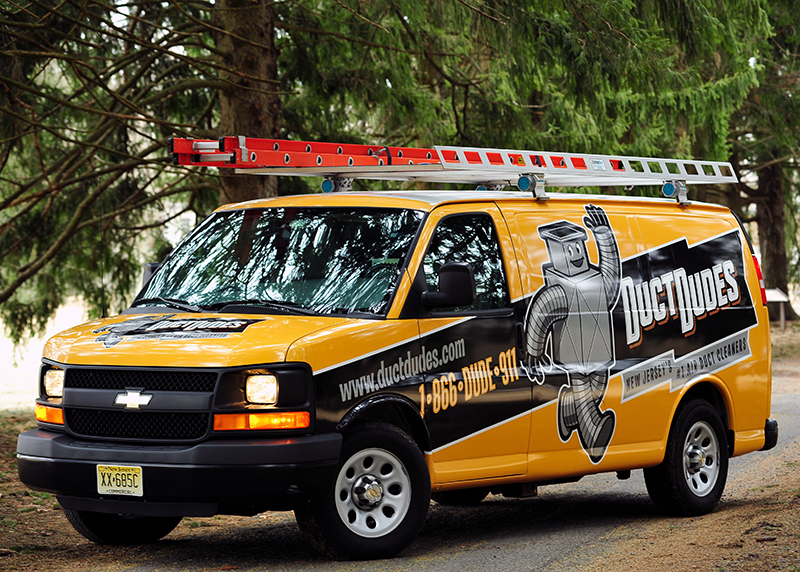
In business since 2004, Duct Dudes was started by Tom Lachowicz as a hobby. It wasn’t until recently, however, that he realized he could make this a fulltime business.
For years he’d been in contact with Graphic D-Sign’s Antonelli, who advised him to budget himself and brand himself the right way when he was ready.
“I hit some big scores and decided to take all my money and dump it into developing the brand,” Lachowicz says. “It was the best thing I could have done.”
His truck is frequently on jobs in busy Manhattan where it’s not uncommon for tourists to stop and take pictures.
“The little character has taken on a life of his own,” Lachowicz says. “Our sheet metal guys want to manufacture a replica for us. The van and website is so catchy, it’s already paying off big time.”
At the heart of it, the Tops-in-Trucks Fleet Design contest is a celebration of branding excellence in HVACR.
The process of branding requires the integration of many things: vision, mission, message, image, differentiation, advertising, logo, name recognition, customer service, training and teamwork. These factors come together to produce a consistent and unique company service model.
A great truck design is more than simply good looks — it’s a communications tool that emphasizes the company’s brand.
The point of branding is to have the customer view you as the only solution to their problem. To do that, you have to get their attention and communicate in a clear and concise way.
Over the years, our winners have showcased their understanding of what it means to communicate who they are using the biggest asset they have: their fleet. This year’s winners, runners up and special recognition recipients are an example for the industry of companies who have invested the time, effort and money to achieve great design and marketing strategies.
We’ve consulted with hundreds of HVACR contracting business owners and several graphic design companies to establish the criteria we feel determine the best of the best. Below are the judging guidelines we follow to select the winning entries.
Basic Information:
Of course, there are always exceptions, and, when accompanied by suitable justification, we do consider those entries as well.
We mean no offense by not selecting your design and it doesn’t mean you can’t win in the future.
July HVACR News
July HVACR News
July 2026 Products